There are many types of logo design. Our business name is pretty long and a generic font alone is not enough. Therefore, we have created a lettermark logo from our initials.
Logo Design Idea and Concept
Business Description
New Vision Media Canada is more than just a Graphic Design Company. Aside from designing graphics, we turn vision into reality for brands and businesses.
Inspiration
Among the Graphic Design Trends of 2020 are Color Gradients and Bold Typography. These are some of the influences that built the logo design of New Vision Media. The idea is to have a symbol that will represent the boldness and creativity of the company.
Details
Initials
The complete name of the company which is “New Vision Media” is kind of long for a logo so we’ve used its initials to make it simple and easy to remember.
Eye
The downward curve represents vision which enables us to see things differently and creatively.
Typography
Font: Montserrat
Case: Upper Case, Title Case
Weight: Extra Bold, Extra Light
Style: Sans Serif
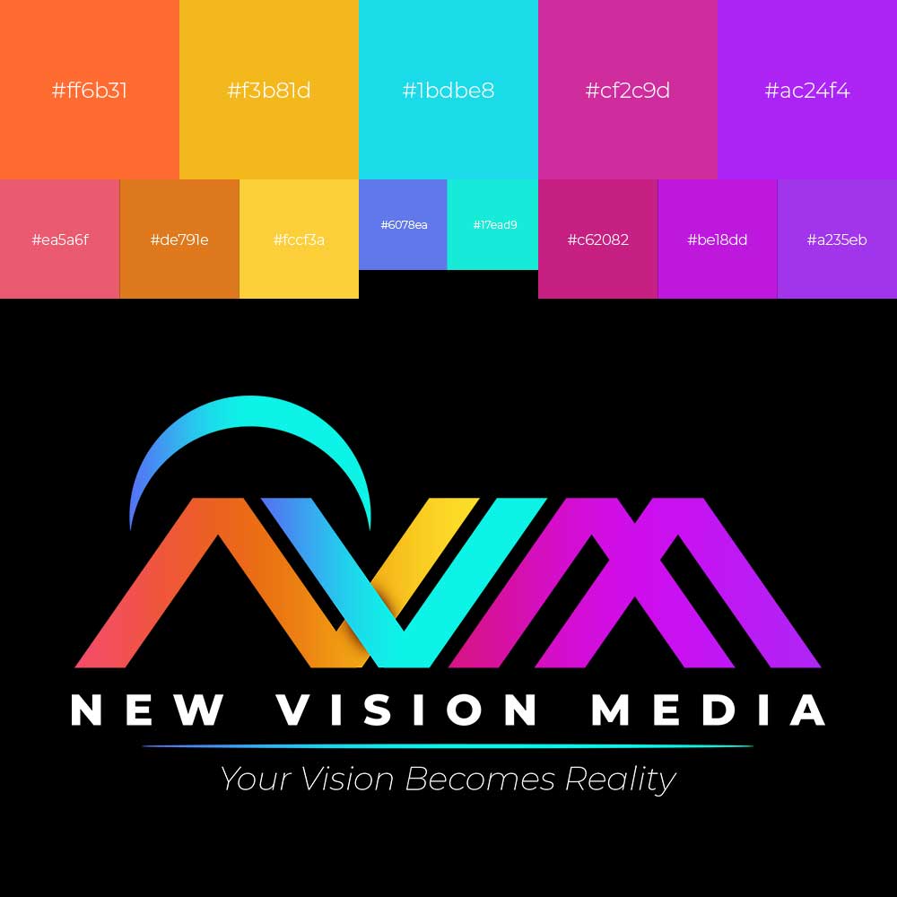
Color: Burning Orange, Buttercup Yellow, Bright Turquoise, Cerise, Electric Violet
Palette
The palette is derived from the five main colors: Burning Orange, Buttercup Yellow, Bright Turquoise, Cerise, Electric Violet. Light and dark shades of each color are used to produce the gradients.


